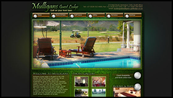
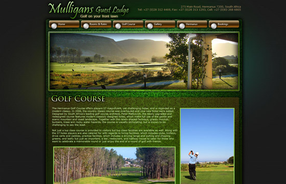
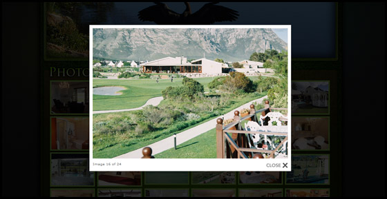
The Mulligans Guest Lodge website is an upgrade from their previous website. One of the main aims of this new website was to show that this establishment is on the Hermanus Golf Course and therefore target golfers on holiday as well as to usual holiday maker. So to convey the point we used large rotating images on the front which clearly give you an indication of it’s positioning, but also orientated the website largely around the theme of golf (since of course the Lodges major attraction is the Golf course right on it’s door step). By doing this we could use a vibrant green, which allows this website to stand out quite nicely.


Leave a Reply
You must be logged in to post a comment.